Blog Post #2: Shakespeare Performance Archive Logo and Site Layout
|
|
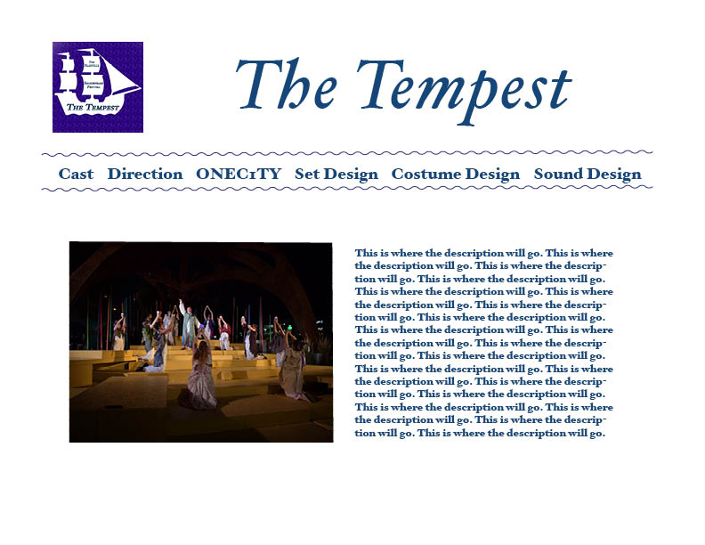
As shown in the above image, I created a mock-up of a potential design that our Digital Literacies class could use for our archive of The Nashville Shakespeare Festival's production of The Tempest. Within that task, we were also told to create a logo for play's archive. Mine is pictured to the right of the webpage and is placed in the top left corner of the mock-up.
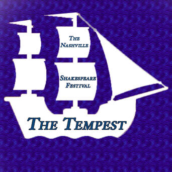
The logo is simple, but the viewer can get what they need from it. Without any context of The Nashville Shakespeare festival or The Tempest, the viewer can assume that the logo represents a specific production of one of Shakespeare's plays that took place in Nashville. The words tell you what the logo actually is and the design tells you what you might expect in the plot and production due to the ship outline and wave-like background.The outline of the ship and words are centered and the background is just one pattern so the viewer's eye is directed toward the center, making sure they are the first things you notice.
On the actual webpage itself, the ship logo also acts as a guide for the audience's eyes. The tip or bow of the boat points toward the title of the site. The site, like the logo is very basic, but still gets the point across. There contrast of the white background and darker blue lettering make the text easy to read. There is a minimal use of various colors to stick to the boat/ocean theme and also so the viewer's eyes aren't overwhelmed when looking at it. The squiggles that are on the top and bottom of the navigation bar keep with the wave and ocean theme as well. There are no other links or items to look at or click through so the user knows where to go directly after viewing the home page. To further improve the site, I may add more images to the home page and a pastel background cover.
