Parkland Student Denied From Harvard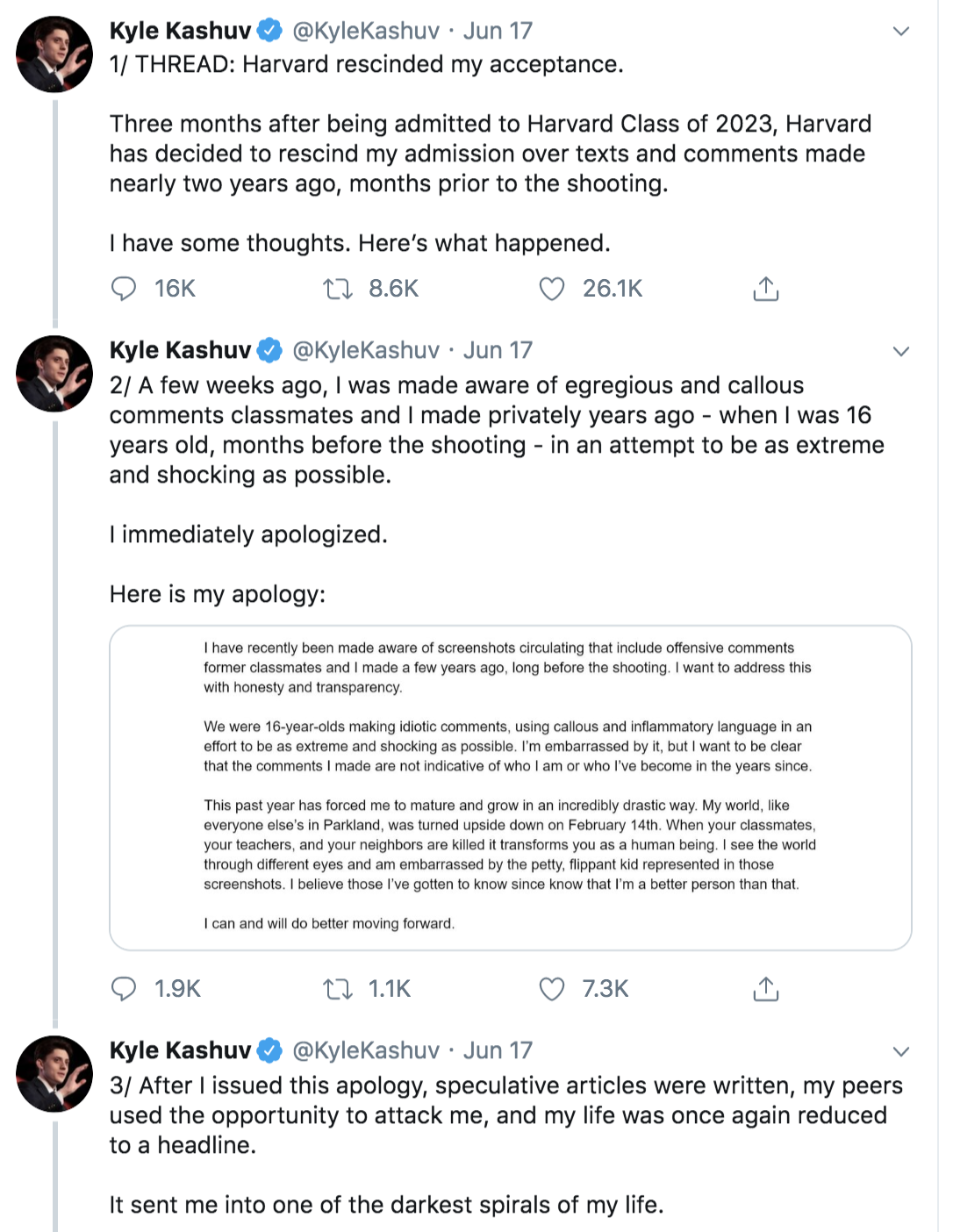
When thinking of a digital mistake or miscommunication that went viral, I think of Kyle Kashuv. Kyle is one of the many student activists who emerged from the horrible shooting at Marjory Stoneman Douglas High School in Parkland, but unlike a few of his other well-known classmates, Kyle took a conservative approach/response following the shooting by supporting the second amendment.
Just last year, Kyle was accepted into Harvard and planned on attending until Harvard took back their offer shortly after. A video was posted after he was accepted which showed screenshots of what he wrote on a Google Doc, including repeated racial slurs, was posted online last month by a former schoolmate. One screenshot even shows Kyle using a racial slur more than a dozen times and even used it to refer to black students. The video was posted by Ariana Ali, a former classmate of Kyle’s and said on twitter that “he’s being held accountable, & I think the consequences were necessary.” A week after the video was posted, Kyle resigned from Turning Point USA (of which he was an outreach director for) and issued an apology statement. Two days later, Harvard inquired about the reports and asked Mr. Kashuv for an explanation. In response to the college, Kyle explained that the comments were the result of students trying to outdo each other with crazy remarks. It is clear that from the situation and responses by Kyle that his comments were not supposed to be received by such a large audience or really any audience. They were comments made to friends in a private google doc. Kyle also did not necessarily mean the derogatory comments made. He says he was joking and didn’t intend to harm anyone. The context behind the comments is that a group of friends in an organization were making jokes (inappropriate and horrible still) that were not meant to be heard or read by anyone outside of that doc. Whoever recorded his comments could have been offended and wanted him to be held accountable, didn’t think it would matter, or possibly felt malice towards him and his conservative views. If that person was offended, they could have taken it up with him personally rather than record the video and send it for others to post. In the simplest sense, he should have avoided making jokes/comments like that in a document for an organization. This case reminds me a little of what happened to Justine Sacco. Another joke that may have been taken too seriously or a person being held accountable for their words in a digital age. It is still a little different because of the audience of both Justine and Kyle. Though Justine did not have a lot of twitter followers, she still posted her “joke” on a public social media platform. When posting on such a public platform, you know that it is possible and likely that it will be seen by others. Kyle typed his comments on a private Google Doc and even deleted them after. Someone just happened to take a recording without his knowing. While Kyle’s comments were certainly wrong, I am left unsure if he deserved a denial from Harvard and media spotlight because of it. Storyboard #1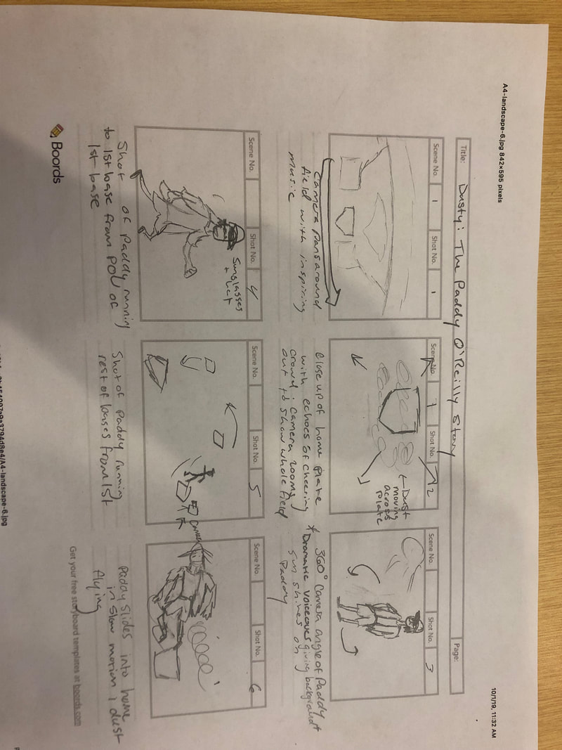
|
Storyboard #2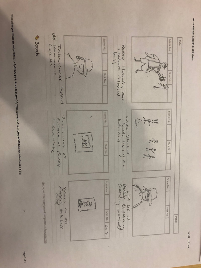
|
Introductory Website
Design Justification
This website was truly one of the most difficult assignments I’ve had, but it’s one that made me learn a lot. I realized that I truly don’t know as much as I thought I did about the digital world and that what I do know is only the tip of the iceberg. Though I didn’t really achieve the design I initially had in my head, I’m still pretty satisfied with the end result.
I started creating this website through our class’s html/css homework assignment and quiz. I add more to the template given to us and switched things up to make it more personalized. It probably took me about two days to figure out how to change the background color and then a very short amount of time to figure out everything else. I spent a lot of time trying to change the “Meg Barron” header to blue, but for some reason it wouldn’t change. I had a lot of fun adding the Spotify playlist and tweets because it makes the site seem more complex when it was very simple to just embed the link and URI. The W3Schools website was a huge help in figuring out how to style a specific item in the css page. Dr. Overall’s video from the quiz we took was a lifesaver as well in helping me pad text and shift things around to where I wanted them.
Originally, I wanted my website to be spaced out much more with a border around the navigation bar, but I could not figure it out. My site content ended up being very cluttered in the center, but I’m glad it is at least centered and the sides are cleared. The border surrounding all of the content makes the site seem more organized than it actually is. I think it would have been cool to have a photo gallery where the images slide through on their own rather than having a bunch on the page to scroll through. I wish I was able to figure out how to make a more textured or designed background than just a color as well. I wanted my site to look kind of like Banksy’s but that result was not achieved.
The mode I used most was probably visual. I had pictures, text, tweets, links, and a playlist. The playlist serves both a visual mode and an aural mode since you can interact with it to play music. The border acted as a spatial mode, drawing the eye to the center of the page. The text I have talking about my site and myself is an example of the linguistic mode. The one mode I did not utilize was gestural. The closest thing to gestural might be the picture of me in which I am smiling and pointing at the name of my favorite band, which may indicate that I was excited.
The white background was in contrast to the colors of my text, images, links, and other items on the site. The alignment of the content was centered and went from top to bottom mostly but also went from left to right on the home page. The content was all in very close proximity to each other which made the site look a little unorganized. Overall, the site was simple and close together.
 RSS Feed
